ppn <- function(..., d=0, raw=F) {
  pts <- list(...)
  deg <- length(pts) - 1
  x <- map_dbl(pts, ~ .[1])
  y <- map_dbl(pts, ~ .[2])
  M <- matrix(map(0:deg, ~ x^.) %>% unlist(), nrow=deg+1, byrow=F)
  k <- solve(M, y)
  poly <- polynomial(k) %>% change.origin(-d)
  if(raw) return(poly)
  if (d == 0)
    return(poly %>% as.function())
  else if(d > 0)
    return(\(t) ifelse(t < d, y[1], poly %>% predict(t)))
  else
    return(\(t) ifelse(t < x[3]+d, poly %>% predict(t),  poly %>% predict(x[3]+d)))
}Rationale
Recently, I had to explain how to evaluate the linearity of an instrument, defined as its maximum deviation from a purely linear relationship between input (the measurand) and output (its measure).
To show the procedure I had to create some fake data of an instrument with a slightly non-linear static characteristic, with an added mechanical hysteresis, i.e., such that there’s a dead band in the response when the input change is reversed.
Data generation
Let’s start with a factory function that generates a hysteresis function given a number of points through which it must pass, and an amount of hysteresis.
The number of points given to the factory function is the degree of the polynomial that will be fitted to the data, plus 1. So if you give it three points, you’ll get a parabolic function.
The argument d is the width of the hysteresis loop. If d is positive, the offset is to the right and at the beginning; if negative it is to the left and at the end.
The argument raw is a flag that, if TRUE, returns a polynomial object, otherwise the function itself.
This function is a bit tricky:
- it takes a variable number of arguments, collected by the
...argument, which is then converted to a list of points; - from the list of points we extract the vector of \(x\) and \(y\) values;
- we calculate the coefficients of te polynomial of degree \(n\) passing through the \(n+1\) points by solving (with
solve(M, y)) the linear system: \[ \mathbf M \mathbf k = \mathbf y \] where \(\mathbf M\) is the Vandermonde matrix, \(\mathbf k\) is the vector of coefficients, and \(\mathbf y\) is the vector of \(y\) values; In turn, the Vandermonde matrix is calculated by raising the \(x\) vector to the power of \(0, 1, \ldots, n\) and stacking the results in a matrix: \[ \mathbf M = \begin{bmatrix} 1 & x_1 & x_1^2 & \ldots & x_1^n \\ 1 & x_2 & x_2^2 & \ldots & x_2^n \\ \vdots & \vdots & \vdots & \ddots & \vdots \\ 1 & x_n & x_n^2 & \ldots & x_n^n \\ \end{bmatrix} \] - finally, we translate the polynomial to the width of the desired hysteresis loop (
change.origin(-d)), if any, and clip the output to the minimum or maximum value at the border.
Now we can create three functions, one with no hysteresis (to be used as a reference), and two for the upward and downward branch with hysteresis. We provide three points, so the result is slightly parabolic, close to the diagonal segment from \((0,0)\) to \((2,2)\):
p <- ppn(c(0, 0), c(1, 0.95), c(2, 2))
p_up <- ppn(c(0, 0), c(1, 0.95), c(2, 2), d=0.2)
p_down <- ppn(c(0, 0), c(1, 0.95), c(2, 2), d=-0.2)
Next step is to finally generate some data. We’ll generate 100 points from 0 to 2, and we’ll add some noise to the two branches:
df <- tibble(
  x=seq(0, 2, length.out=100),
  y=p(x),
  y_up=p_up(x) + rnorm(length(x), 0, 0.02),
  y_down=p_down(x) + rnorm(length(x), 0, 0.02)
) %>%
  pivot_longer(-x, names_to="direction", values_to="y")

df %>%
  ggplot(aes(x=x)) +
geom_path(aes(y=y, color=direction)) 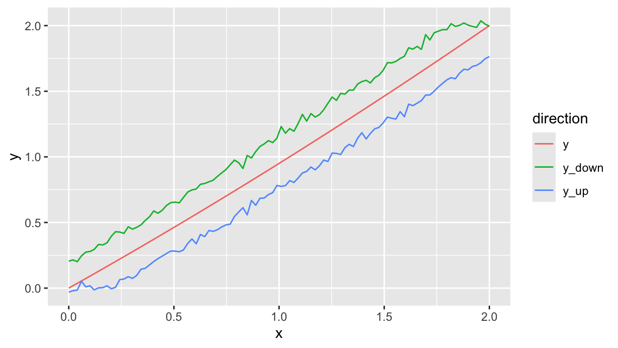
Collecting data in logical sequence is never a good idea, so le’s shuffle the data, pretending that each predictor value is measured in a random order:
df %>%
  filter(direction!="y") %>%
  mutate(
    seq=sample(n()),
    .before=x
  ) %>%
  arrange(seq) %>%
  ggplot(aes(x=x, y=y)) +
  geom_path(alpha=0.2) +
  geom_point(aes(color=direction))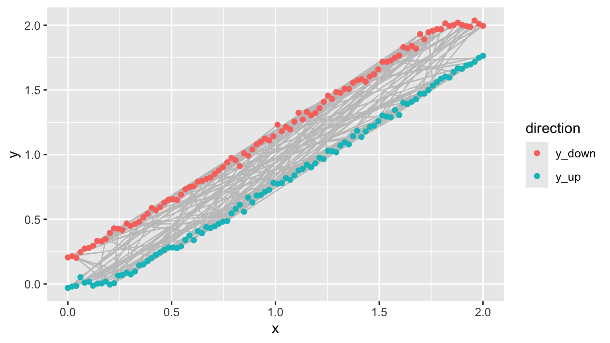
Data analysis
So far we have only generated data for a fake experiment. Now let us pretend that the df data frame is the result of a real experiment, and we have to analyze it.
First of all, we perform a linear regression of a first order model.
df.lm <- lm(y~x, data=df)

df %>%
  add_residuals(df.lm) %>%
  filter(direction!="y") %>% {
    ggplot(., aes(x=x, y=resid)) +
    geom_point() +
    geom_hline(yintercept=mean(.$resid), color="red")
  } %>%
  ggMarginal(type="histogram", margin="y")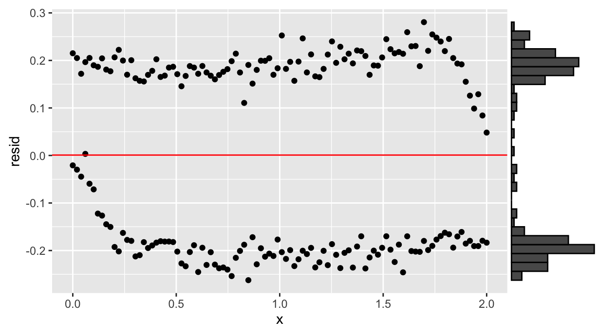
The residuals show a bimodal distribution, hint of hysteresis.
We can split the data in two parts and fit two models, depending on the side of the residuals w.r.t. the red line in the last plot:
df.exp <- df %>%
  filter(direction!="y") %>%
  add_residuals(df.lm) %>%
  mutate(branch=ifelse(resid<mean(resid), "up", "down"))

df.exp %>%
  ggplot(aes(x=x, y=y, color=branch, shape=direction)) +
geom_point() 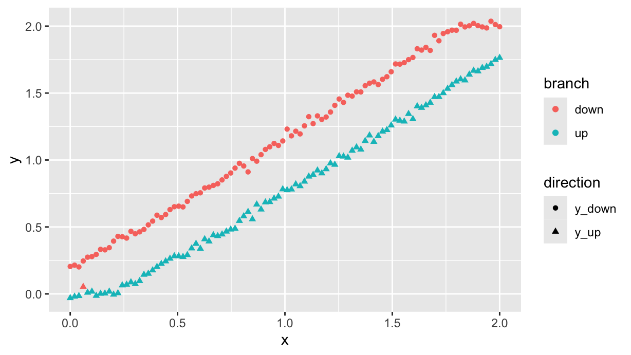
To be clear, this is just to show that even if the measurements were performed in random order, it is still possible (with some minor classification errors) to separate the two branches by looking at the residuals.
Next step is to do the regression on the two separate branches. Let’s do that for the upward branch:
df_up <- filter(df.exp, branch=="up")

df_up.lm <- lm(y~poly(x, 2, raw=T), data=df_up)
summary(df_up.lm)
Call:
lm(formula = y ~ poly(x, 2, raw = T), data = df_up)

Residuals:
      Min        1Q    Median        3Q       Max
-0.056088 -0.018095 -0.000484  0.015756  0.081366

Coefficients:
                      Estimate Std. Error t value Pr(>|t|)
(Intercept)          -0.112100   0.008669  -12.93   <2e-16 ***
poly(x, 2, raw = T)1  0.761033   0.019812   38.41   <2e-16 ***
poly(x, 2, raw = T)2  0.096591   0.009518   10.15   <2e-16 ***
---
Signif. codes:  0 '***' 0.001 '**' 0.01 '*' 0.05 '.' 0.1 ' ' 1

Residual standard error: 0.02847 on 96 degrees of freedom
Multiple R-squared:  0.9974,    Adjusted R-squared:  0.9974
F-statistic: 1.872e+04 on 2 and 96 DF,  p-value: < 2.2e-16
At this point, we actually should verify the residuals and perform the validation. Let’s skip this for the moment, and use the result to calculate the deviation from linearity:
sc <- df_up.lm %>% coef() %>% polynomial() %>% as.function()

df_up %>%
  ggplot(aes(x=x, y=y)) +
  geom_point()  +
  geom_function(fun=sc, color="red", xlim=c(0, 2)) +
  labs(title="Upward branch")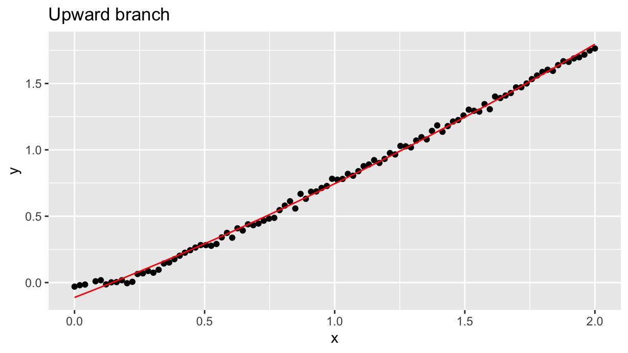
Linearity estimation
Now we want to estimate the linearity of the upward branch. We’re only using the regressed model to estimate its deviation from linearity, not the data themselves.
To start, we need the linear function passing through the first and last point of the upward branch, i.e. \((0,0)\) and \((2,2)\). We can reuse the factory function ppn with two points:
p_lin <- ppn(c(0, sc(0)), c(2, sc(2)), raw=T)

ggplot() +
  geom_function(fun=as.function(p_lin), color="blue", xlim=c(0, 2)) +
  geom_function(fun=sc, color="red", xlim=c(0, 2))
As well we can plot the difference. Polynomials objects can be subtracted (that’s why we added the option raw=T to the ppn() function!), and the result is a polynomial object:
lindev <- df_up.lm %>% coef() %>% polynomial() - p_lin
ggplot() +
  geom_function(fun=as.function(lindev), xlim=c(0, 2)) +
  labs(y="Deviation from linearity (%)", x="x")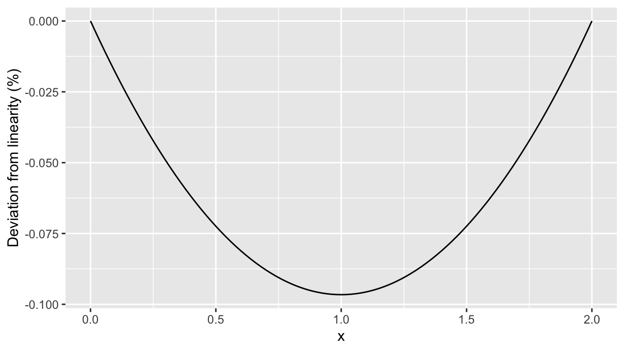
So the maximum absolute deviation from linearity happens at 1.0 and is about 0.1 c.u.. Its value (in percentage) can be calculated by setting the derivative to 0: the polynomial lindev can be derived and solved to find the maximum deviation from linearity:
xmax <- lindev %>% deriv() %>% solve()
(as.function(lindev)(xmax) %>% abs() / 2 * 100) %>% round(2)
[1] 4.83That’s all, folks!