knitr::opts_chunk$set(
  fig.align = "center",
  # This for default device
  out.width = "12cm",
  # This two for high quality charts:
  fig.asp = 9/16
)
library(tidyverse)
example_url <- function(example) {
  url = paste0("https://paolobosetti.quarto.pub/data/", example)
  return(url)
}

df <- example_url("cotton.dat") %>%
  read.table(comment = "#", header = TRUE) %>%
  mutate(Cotton = factor(Cotton))
The Tukey’s test is a very useful statistical test to compare the means of different samples. It is a multi-sample version of the Student’s T-test.
In R, the Tukey’s test is implemented in the TukeyHSD() function that calculates the test statistics, the confidence intervals, and the p-values. That function returns an object that has the plot() method, so that you can easily visualize the results.
Let’s see an example. We have a dataset with the tensile strength of yarns with different content of cotton fibers.
| Run | Cotton | Strength |
|---|---|---|
| 14 | 15 | 7 |
| 23 | 15 | 7 |
| 20 | 15 | 15 |
| 16 | 15 | 11 |
| 21 | 15 | 9 |
| 24 | 20 | 12 |
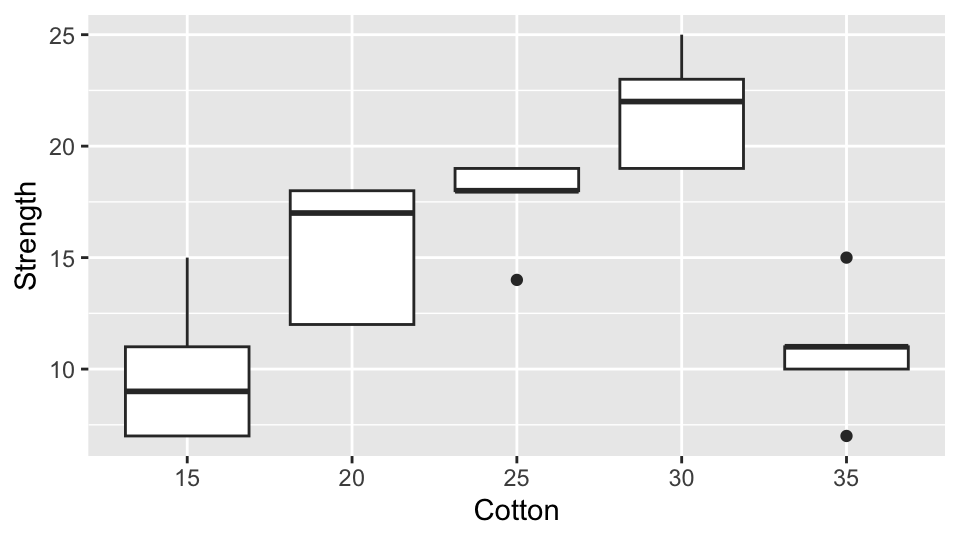
First, let’s visualize the data. It seems that the strength of the yarns is different for different cotton contents:
df %>%
  ggplot(aes(x=Cotton, y=Strength)) +
  geom_boxplot()
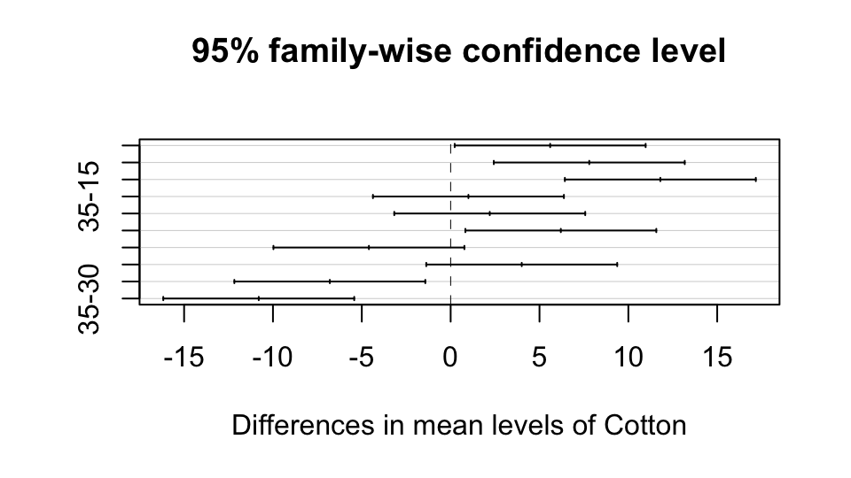
The Tukey’s test can help understanding which of those differences are significant:
df.tuk <- TukeyHSD(aov(Strength ~ Cotton, data = df))
plot(df.tuk)
Now if we want to mix this plot in a document using GGplot2, it doesn’t fit much nicely, does it?
My solution, for these situations, is to define the following function:
ggTukey<-function(Tukey, which=1){
  if(!require("tidyverse")){
    install.packages("tidyverse")
    library(tidyverse)
  }
  Tukey[[which]] %>%
    fortify() %>%
    rownames_to_column("id") %>%
    rename(min=lwr, max=upr) %>%
    ggplot(aes(x=id)) +
    geom_point(aes(y=diff)) +
    geom_errorbar(aes(ymin=min, ymax=max), width=0.2) +
    geom_hline(yintercept=0, color="red") +
    labs(y="Difference", x="") +
    coord_flip()
}
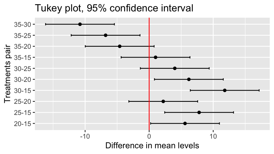
Then use it in place of the plot() method (note the added layer):
ggTukey(df.tuk) +
  labs(
    y="Difference in mean levels",
    x="Treatments pair",
    title="Tukey plot, 95% confidence interval")
Apart from the different ordering of pairs, it’s the same plot as before, but now it’s a GGplot2 plot that can be easily customized, and it is even more readable.
That’s all, folks!