examples_url("timeseries.csv")[1] "https://paolobosetti.quarto.pub/data/timeseries.csv"During the courses, example data files are used to illustrate different concepts. These files are available here for download or for direct usage.
Each data file can be separately loaded from the URLs reported down below. Nonetheless, you can also exploit the ability of R read.* functions to open a file directly from its URL. To do so, it can be useful to use the adas.utils::examples_url() function that builds the URL based on the file name:
examples_url("timeseries.csv")[1] "https://paolobosetti.quarto.pub/data/timeseries.csv"Then, just pipe it with the proper file-reading function, e.g.:
examples_url("timeseries.csv") %>% read_csv()or
examples_url("3dprint.dat") %>% read_table(comment="#")Let’s look at the train.csv file from the Titanic dataset. We load the dataset and perform some basic data manipulation to only keep the relevant columns. We also classify the passengers into age classes.
titanic <- examples_url("train.csv") %>%
  read_csv(show_col_types = FALSE) %>%
  mutate(
    Survived = as.logical(Survived),
    Pclass = as.factor(Pclass),
    AgeClass = cut(Age, breaks=c(0, 10, 18, 40, 60, Inf), labels=c("child", "young", "adult", "senior", "elderly")),
    Age = as.factor(Age)
  ) %>%
  select(
    PassengerId,
    Survived,
    Pclass,
    Sex,
    Age,
    AgeClass,
    Fare
  )
titanic %>% head() %>% knitr::kable()| PassengerId | Survived | Pclass | Sex | Age | AgeClass | Fare |
|---|---|---|---|---|---|---|
| 1 | FALSE | 3 | male | 22 | adult | 7.2500 |
| 2 | TRUE | 1 | female | 38 | adult | 71.2833 |
| 3 | TRUE | 3 | female | 26 | adult | 7.9250 |
| 4 | TRUE | 1 | female | 35 | adult | 53.1000 |
| 5 | FALSE | 3 | male | 35 | adult | 8.0500 |
| 6 | FALSE | 3 | male | NA | NA | 8.4583 |
Let’s plot the survival rate by age and sex class, as a histogram.
titanic %>%
  ggplot(aes(x=AgeClass, fill=Survived)) +
  geom_bar() +
  facet_wrap(~Sex) +
  labs(title="Survival by Age Class", x="Age Class", y="Count", fill="Survived")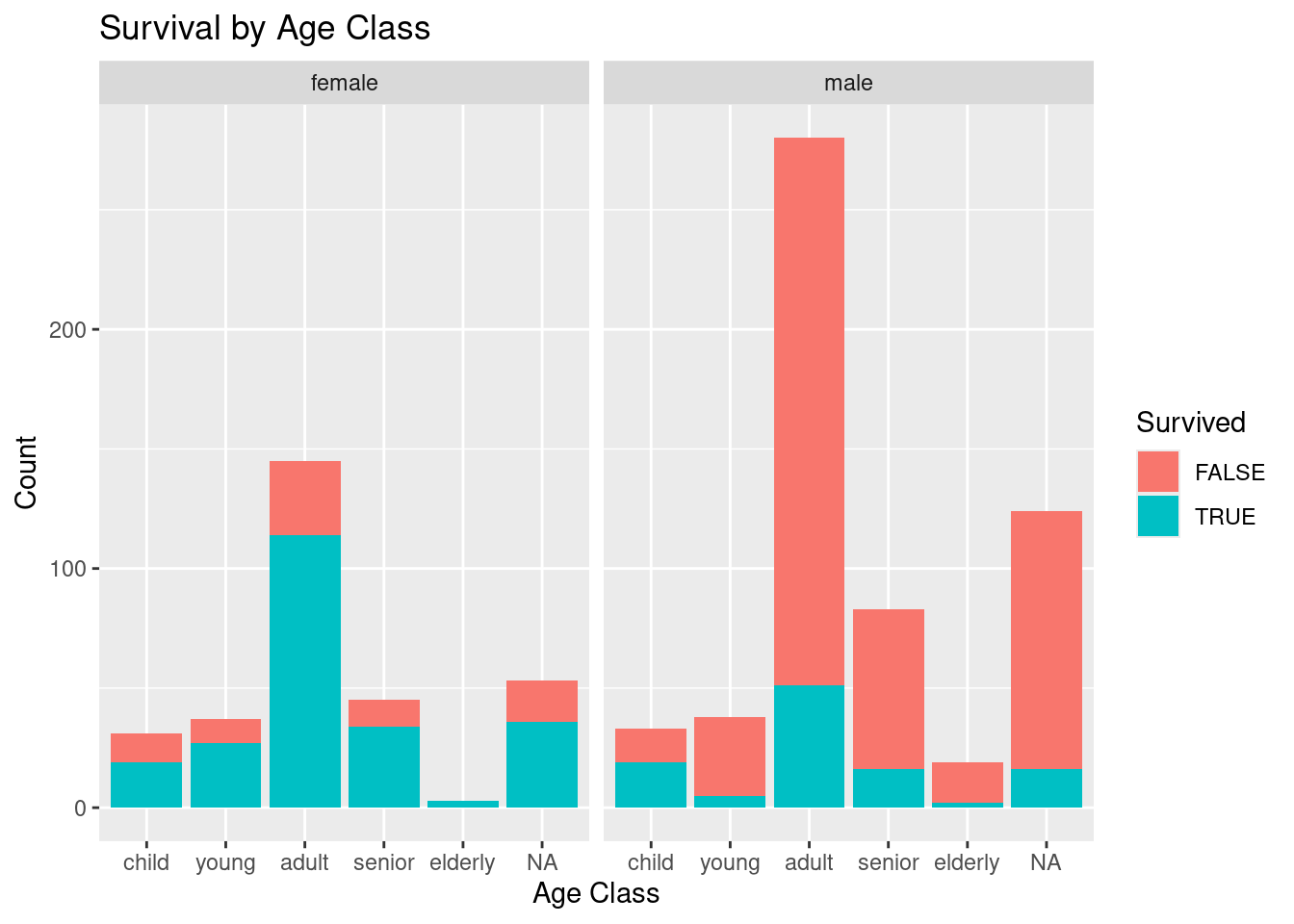
In a more refined way, we can build a generalized linear model of binomial type🇮🇹 to predict the survival rate based on the fare, age class, and sex:
model <- glm(Survived ~ Fare + AgeClass + Sex, data=titanic, family=binomial)

pred <- expand.grid(
  Fare = seq(0, 500, 5),
  AgeClass = levels(titanic$AgeClass),
  Sex = c("female", "male")
) %>%
  add_predictions(model, var="pred.glm", type="response")

titanic %>%
  add_predictions(model, var="pred.glm", type="response") %>%
  ggplot(aes(x=Fare, y=pred.glm, color=AgeClass)) +
  geom_line(data=pred) +
  geom_point(aes(shape=Survived), size=2) +
  coord_cartesian(ylim=c(0, 1)) +
  facet_wrap(~Sex) +
  scale_shape_manual(values=c(3, 1)) +
  labs(y="Predicted Survival", color="Age Class")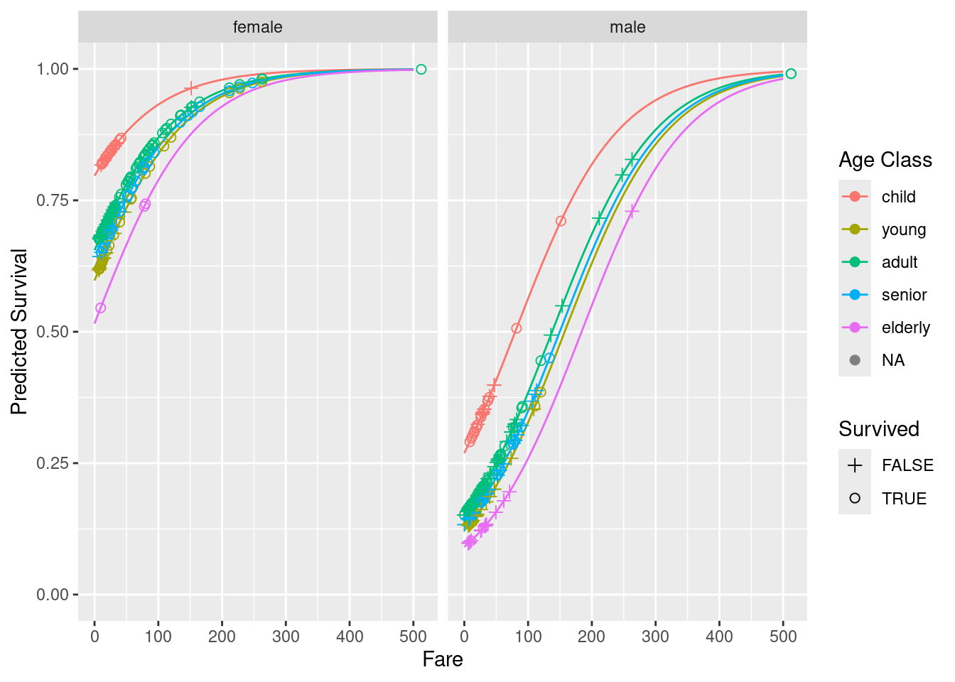
According to our analysis, if you embark the Titanic, you better be a young and rich female 😉.